The Visual Catch-22 of Virtual Summit Photos
While investing in virtual summit photos help to position you as an expert virtual speaker...
..it also has some limitations, as well.
As many speakers and trainers gear up to move more into the virtual speaking world, one of the best ways to get your online reps is by participating in online summits.
Over the past month, I’ve photographed a handful of these events on behalf of speakers looking to create virtual photos to include in their image content portfolios.
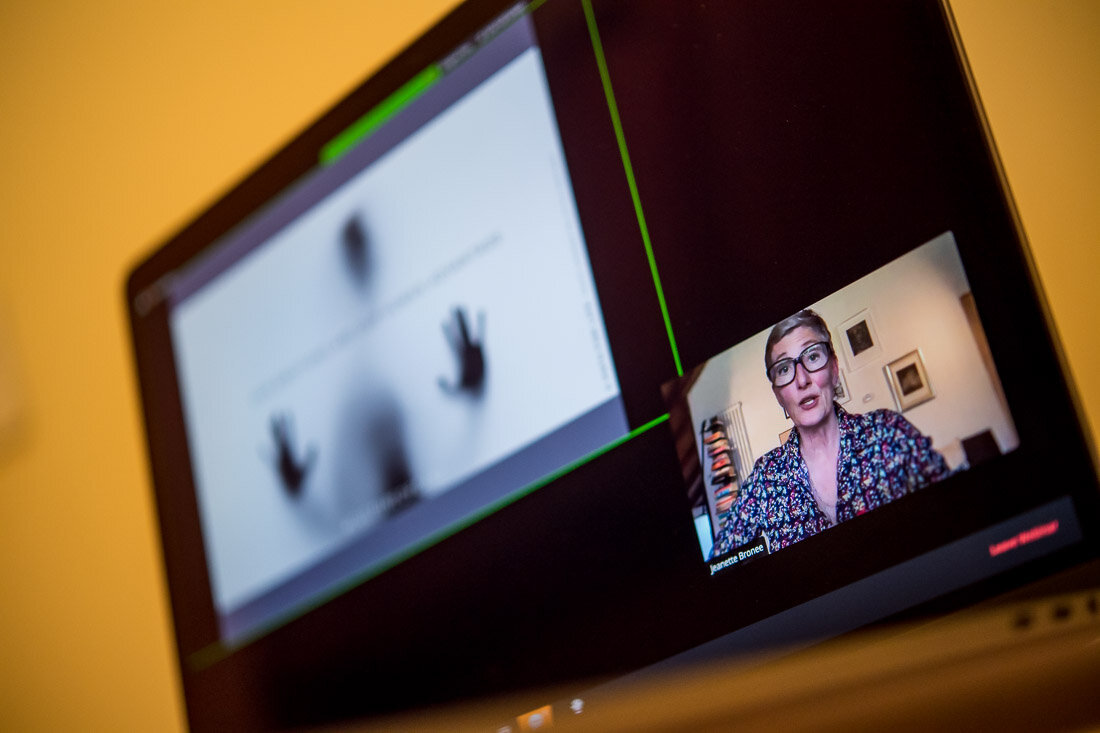
Now, with regard to these summits, rather than simply hold the event in a Zoom room, most of them go a step beyond to offer a higher-production value aesthetic by creating a static layout.
They offer a dedicated window for the speaker’s slides, and a window for the speaker him/herself to make direct eye contact with the audience.
It creates a cleaner visual experience for viewers watching on their computers.
That’s the good news.
The bad news is that that layout is usually in a fixed position and the viewer - or the photographer capturing photos on his laptop - cannot alter the visual layout as if this were a typical Zoom meeting or webinar.
For someone looking to simply consume the content, this surely isn’t an issue.
But for speakers looking to acquire visually diverse image content from this presentation, it hamstrings the visual variety that we’re able to capture.
As a result, It’s a Catch-22 for the speaker - and a pain in the ass limitation that a virtual event photographer has to work around.
One particular client, Jeanette, ran into this very issue.
She hired me to capture her talk for one of these virtual summits - Speak Aid 2020.
While the overall graphic layout is clean and appealing, I couldn’t make the size of her Speaker window any larger.
Although we were able to create some interesting image content and reveal Jeanette’s various expressions as she spoke, I was severely limited in what I could do visually on my end with respect to compositions and angles with my laptop screen.
While she leveraged these photos throughout her social media channels, she wanted photos that presented her more prominently on screen and showcased her as a presenter.
When she reached out and asked if I could capture photos for one of her upcoming talks, I offered her a better solution; book a 30-minute session in her own private Zoom room.
This option presented her with multiple benefits:
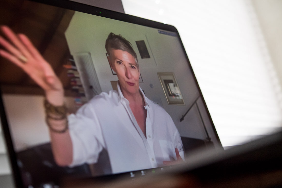
The entire season could be shot in full-screen Speaker Mode
Multiple outfit changes
Vary the visual landscape by moving the laptop and moving into different rooms
She immediately jumped on the idea and we set a date for the magic to happen.
As you can see, there’s a tremendous amount of visual variety when you have full reign over the screen layout for your presentation.
Now, I’m certainly not discrediting capturing speaker images from organizational summits and events.
Those photos offer valuable, visual social proof to other organizations that are considering you to speak for them that you’ve already been tasked with translating your expertise from stage to screen.
But, in terms of building a visually diverse, virtual image content portfolio, leveraging a series of full-screen photos from a variety of vantage points will offer a lot more creative flexibility when you putting together your future social posts and blog articles.
The energy you convey full screen translates easier to the person on the other side of the screen.
Give them the opportunity to see how you bring it through persuasive visual storytelling...virtually, :)
If you’re interested in image content that captures you delivering a virtual presentation, I can certainly help you with that.


