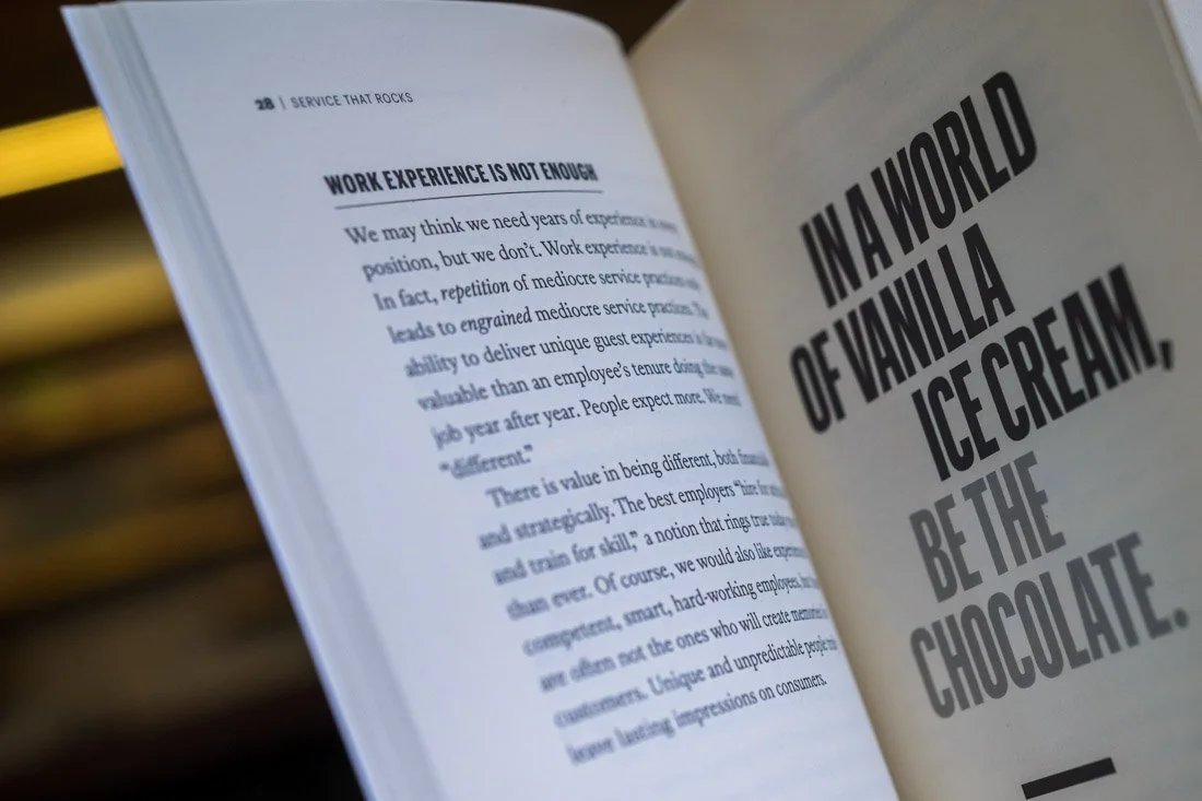
Pull out the pull quotes in your photos.
When creating assets for your book launch…
…photos of the pull quotes are a welcomed asset.
Recently, I conducted a book boudoir session with the book, Service That Rocks, by Jim Knight.
Whenever I receive a book in the mail, I immediately do an audit of what the book looks like on the inside.
Sure, the cover and spine is important, and it gets ample amount of camera time, but, the meat and potatoes of the book is really where the juicy stuff lives.
It is, after all, where the transformation for the reader lives in chapter and verse.
It’s also where the opportunities to create unique visual assets live, as well.
While I’m looking over a wide variety of elements found within its pages:
Chapter title design
Sub-headings
Graphs and charts
Illustrations
Exercises and homework assignments
The big one I’m looking out for is the design and frequency of the pull quotes.
A pull quote is a phrase, sentence or paragraph that’s separated from the regular chapter copy and laid out in a way that stands out, whether placed artfully within the flow of the text or placed on a separate page by itself.
Aesthetically, this quote offers a chance to create a unique piece of visual content while also highlighting something of great importance to the reader.
They’re a no-brainer to photograph — especially when they look cool.
With regard to Jim’s book, they looked REALLY cool. So, I set my sights on hunting down as many of those pull quotes as possible to photograph:
As I mentioned, pull quotes are important points that an author wants to highlight for their readers.
As a result, these phrases, sentences and paragraphs are a layup in terms of complementing these relevant, teachable, bite-sized moments with supplemental content in the caption of the post or article.
This nugget of value naturally offers an opportunity to then provide a natural call-to-action to the viewer of the post to learn more about this concept by buying the book.
Creatively, pull quote photos also offers a chance to compliment the cover and spine photos that are already in the portfolio.
Having both outside and inside shots of the book adds to the visual variety in the assets you leverage to promote the launch or post-launch of your book.
The alternative is simply posting cover photos that ultimately become stale and boring.
In a space where there are 9,000 books that speak on the same topic as yours, creating distinction from other authors in your space is key.
What better way to do that than to showcase your own framework through your words through the photos?
If you’re currently getting your book ready for market, keep this in mind as you and your team devise their marketing and promotional strategy.
These types of photos can really be a boost to your efforts.
If you’d like to learn more about the types of visual assets created during a book boudoir session, check it out here.


