Double the fun
Shooting a cool book cover is a fun experience.
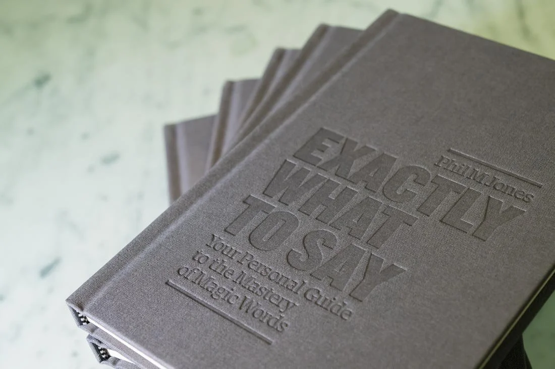
Shooting a cool book cover with another cool hardcover underneath is magical.
Since the #bookboudoir thing became a thing, I’ve been fortunate enough to photograph a wide assortment of beautiful books.
Colors. Shapes. Layout. Typography. Illustrations.
Honestly, I get real nerdy and granular about that shit :)
Regardless of my selfish inclinations, the goal of every book boudoir session is to capture the nuances and wrinkles that highlights both the beauty of the book and the value it holds for those who read it.
This gives the author’s marketing team an array of visual assets with which they can use to help promote the launch, and have enough assets left over for post-launch, online content and other marketing projects.
This visual content helps to create distinction from other author’s titles in their space of expertise by offering the audience a chance to preview the book in their hands through their eyes.
Recently, I was handed a couple copies of Exactly What To Say by Phil M. Jones.
One of the interesting nuances to this book was that, in addition to the clean, bold and crisp simplicity of the jacket cover, there was additional attention and care spent on the hardcover underneath.
Textured fabric cover. Gold leaf letters on the spine. Rounded edges. Debossed lettering on the cover.
Absolutely beautiful - totally befitting the style and grace of its author.
While there were many inside pages to photograph (we’ll get to that later), I knew I wanted to make a big deal about the cover(s) details first.
My strategy was simple:
Take an armload of books into an empty space, keep the jacket on some copies, off on others, and create as much visual variety with various cover and spine shots as possible.
Sounds like a plan. Here’s what came of it:
The black and gray covers play nice together in the sandbox, don’t they?
The benefit of having multiple copies with and without the jacket offered me a chance to create a wide assortment of groupings that led to the creation of a ton of unique, visual assets.
When looking to capture the attention of potential readers of your book, don’t bore them with the standard, INSERT BOOK COVER graphic, especially when the hard cover has a beautiful aesthetic that needs to shine in its own right.
There’s plenty of other folks doing that already.
Stand out by hiring a photographer to create high-quality, image assets that get people excited enough to want to hold the book in their hands and, god forbid, read the damn thing in order to learn something relevant to improving their lives!
Sell some books, change some lives - that’s the name of the game, right? :)
#yeahabsolutely
Ohhh - before I forget…
I mentioned earlier that I also showed some love to the inside of the book. Here’s a peek at what that looked like:
Between the photos of the cover(s) and the inside pages, this creates a well-rounded portfolio of assets that will ultimately serve to inspire potential readers to hit the BUY NOW button.
…and when it comes to Exactly What To Say, that’s money well-spent :)


